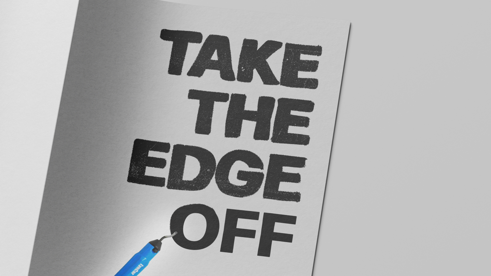
"TAKE THE EDGE OFF" (LynCar)
(collaborative project)
BRIEF:
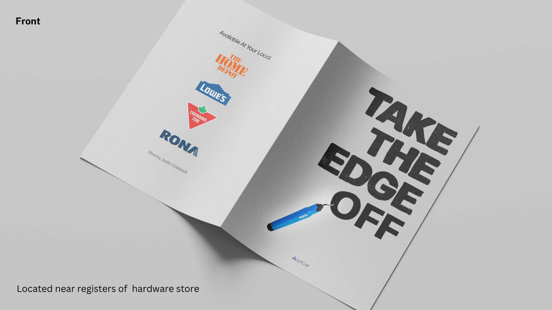
Make an in-store campaign and a brochure of the given strange object to help re-introduce the product into the market
MY ROLE:
Generated concept for visual typography elements (type on brochure and in store campaign)
IDEA/CONCEPT:
Using a play on the words "take the edge off", I chose to create a literal translation of the headline into something visual. While thinking about "taking the edge off" of something, I found a way to show it visually by using two different types of typefaces. One with rough edges and one with smooth.
Brochure (Front)
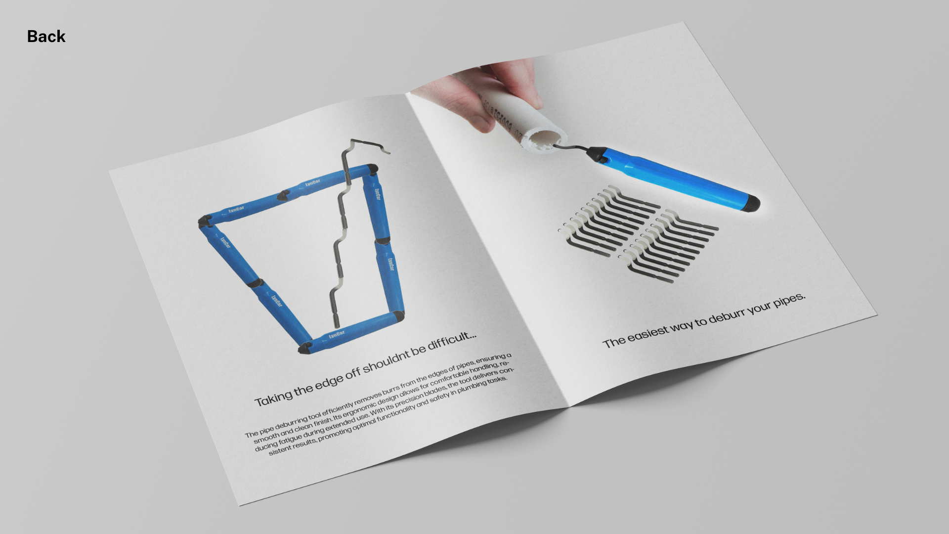
Brochure (Inside)
Brochure (Back)
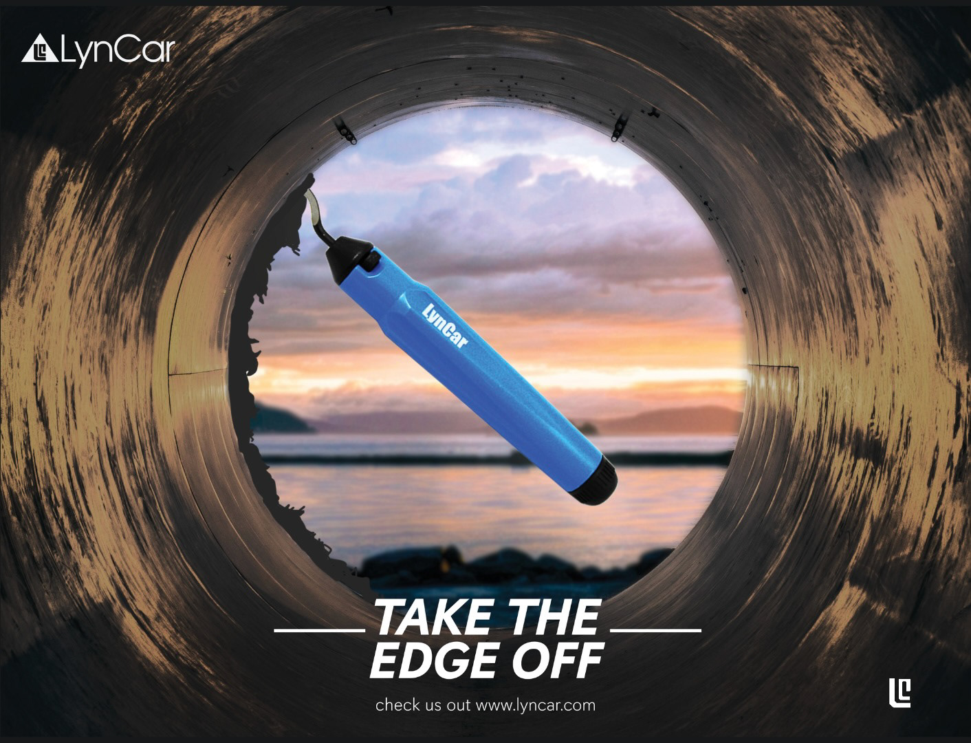
Final Ad
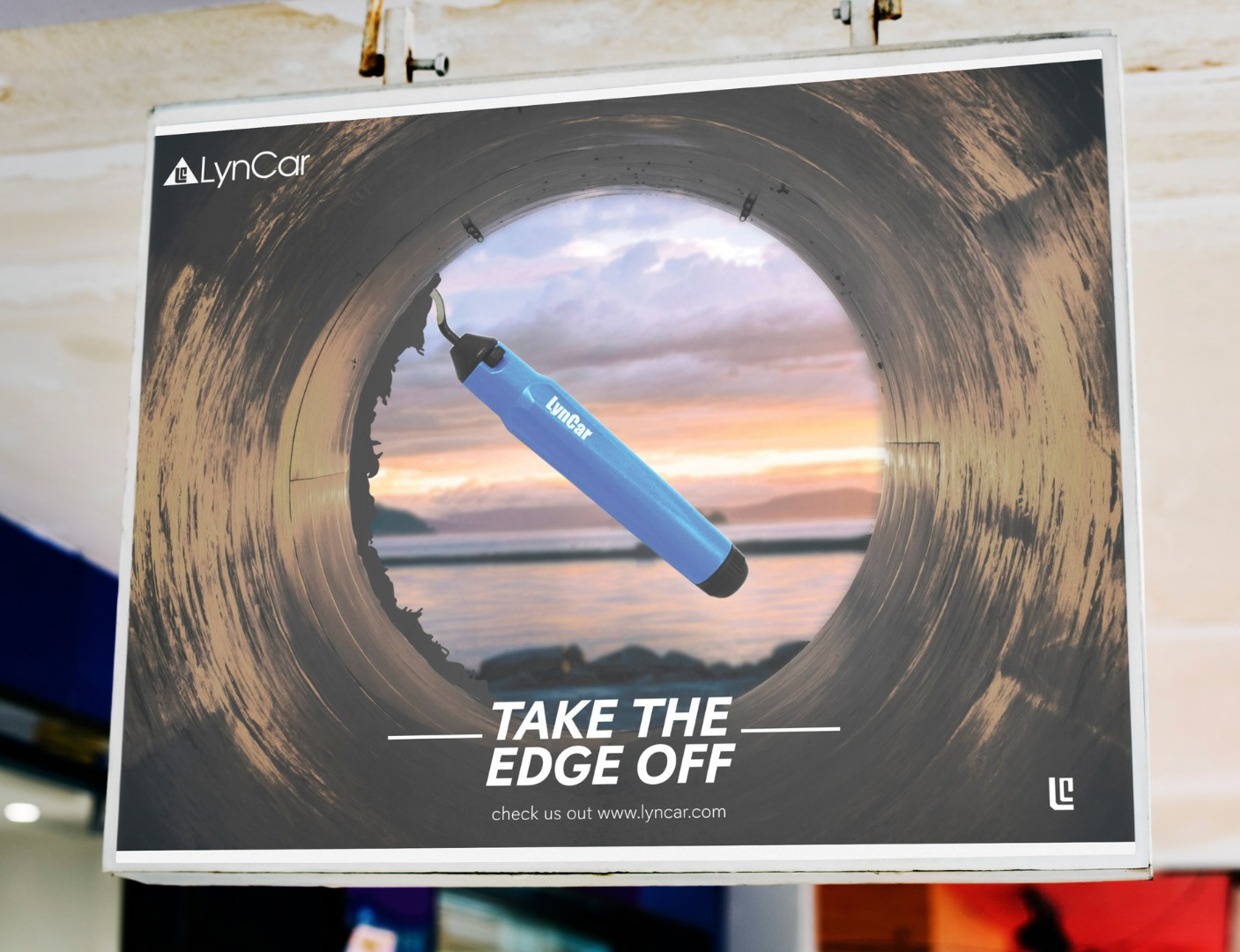
In-Store Mockup
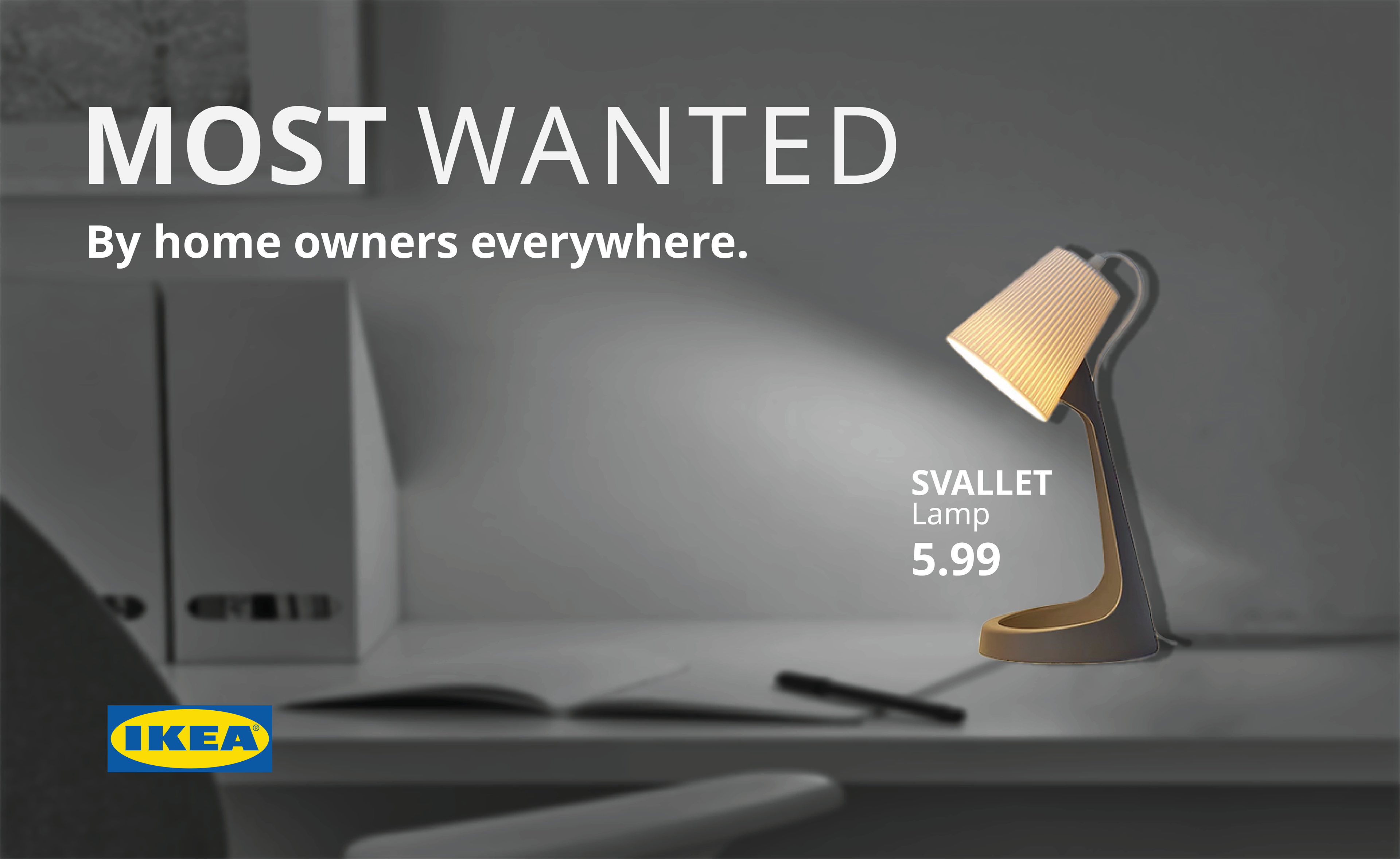
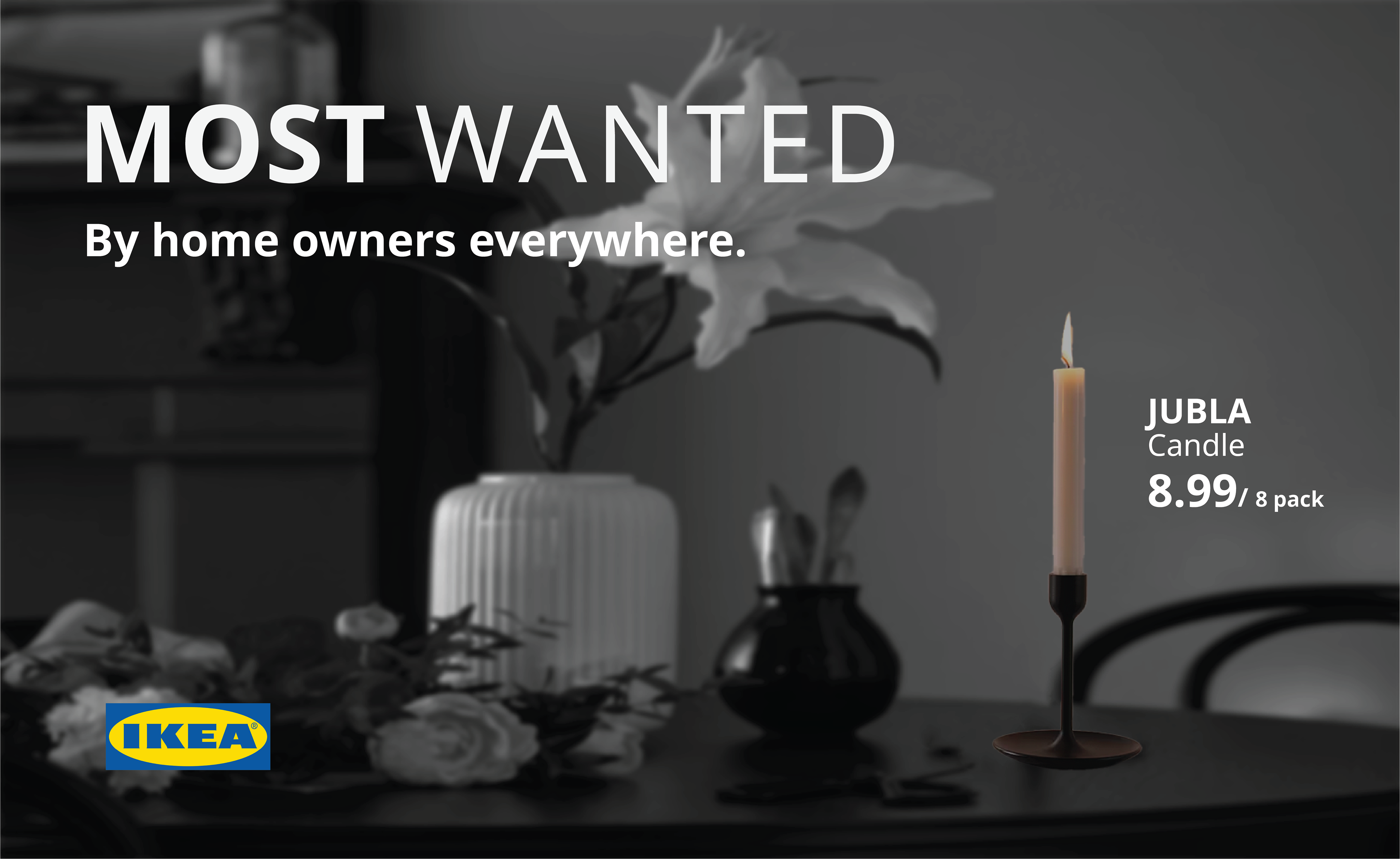
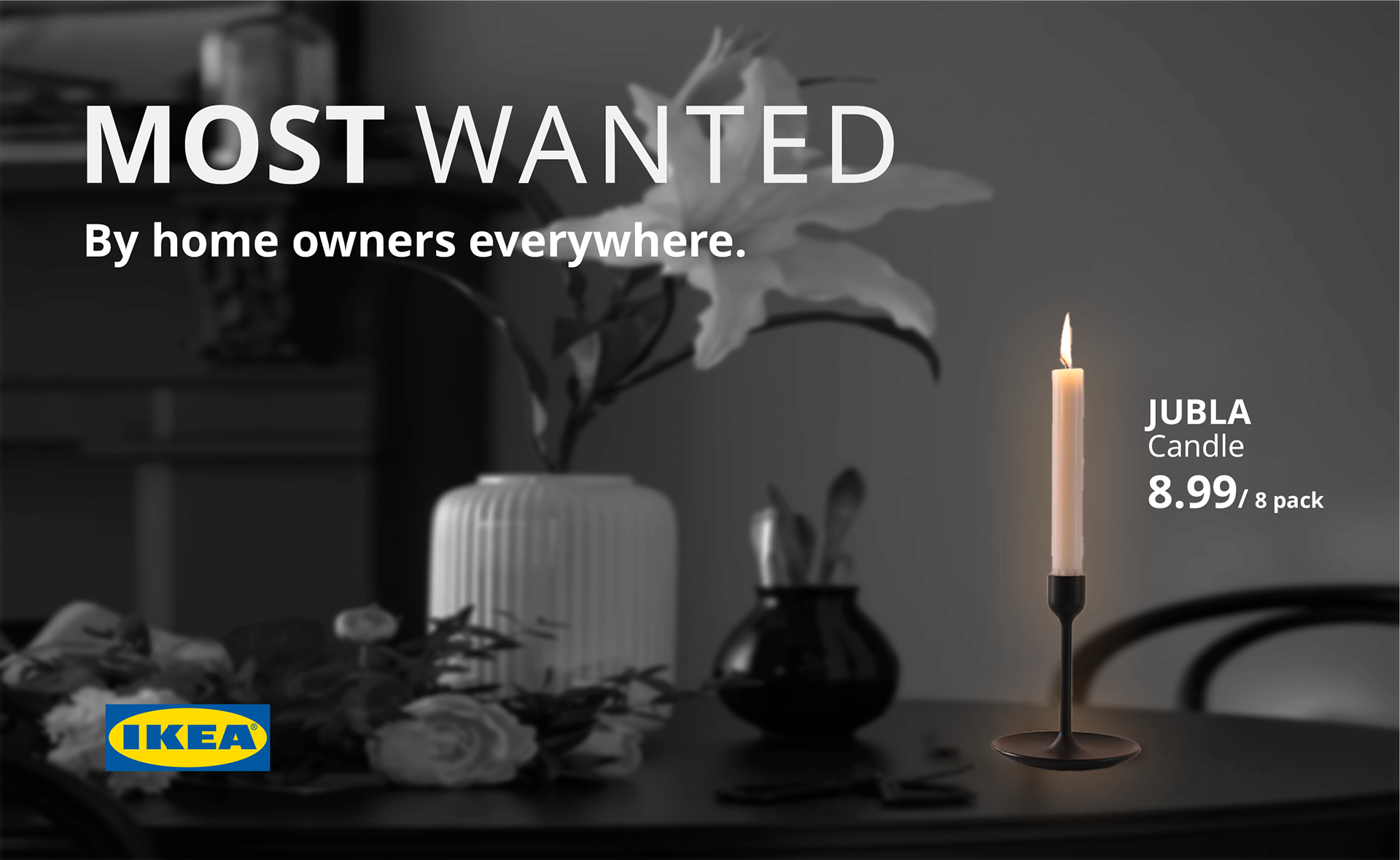
"MOST WANTED" (Ikea)
BRIEF:
Take an existing ad concept and rewrite it for an updated audience
INSIGHT:
Customers won’t expect the low prices IKEA has to offer
IDEA/CONCEPT:
My design strategy for this campaign was to grab attention while still remaining simple. Ikea is known for minimalism and simplicity that I wanted to convey through drawing attention to certain parts of the ad. Keeping in mind the intended placement was a billboard, I decided to use light to draw the viewers eye to the product leading me to expand it into a "night time" version that changes after sunset, further reinforcing the "most wanted" headline.
FINAL ADS
Version 1
Day Version 2
Night Version 3
MOCKUPS
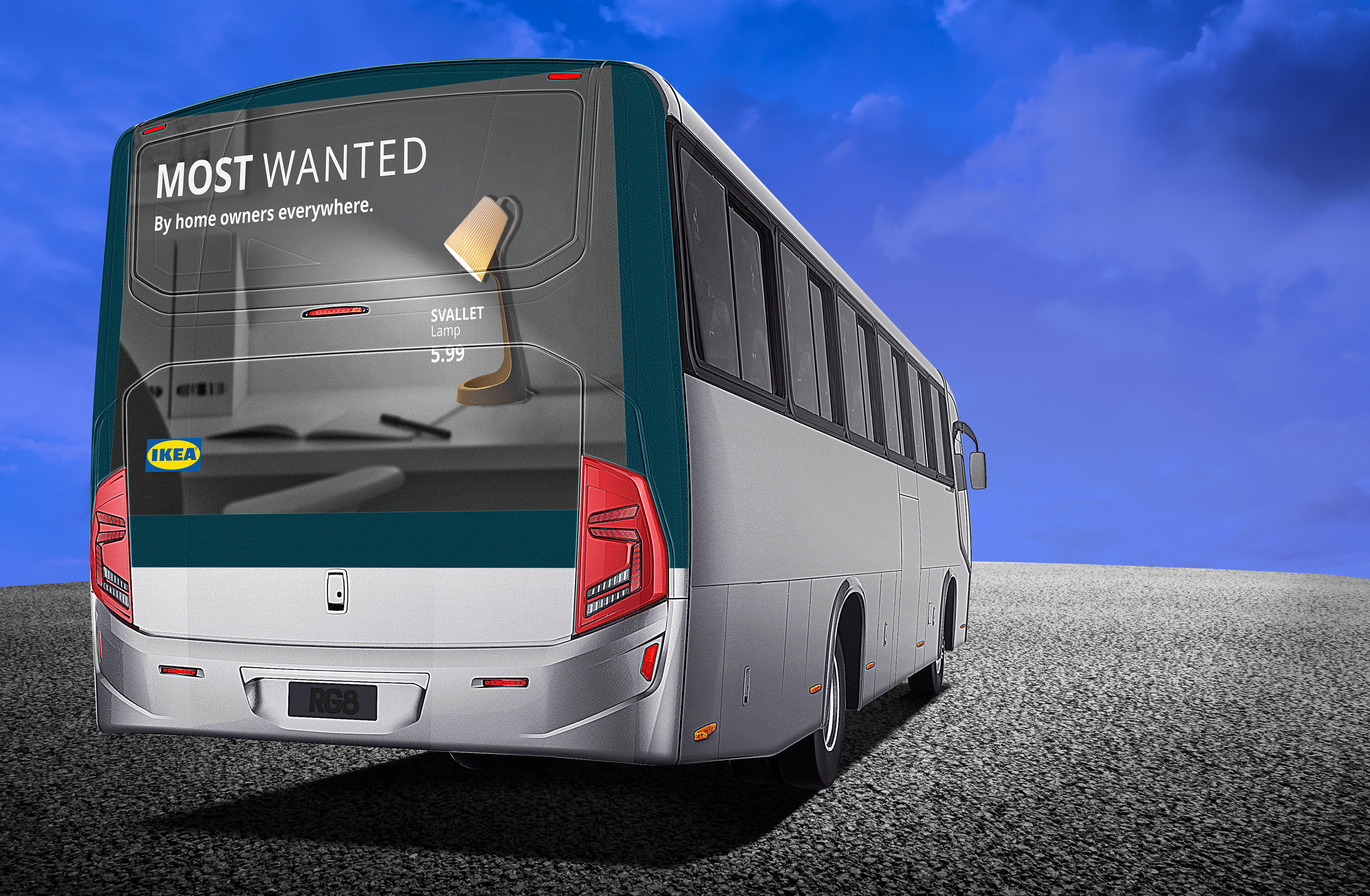
Bus Ad
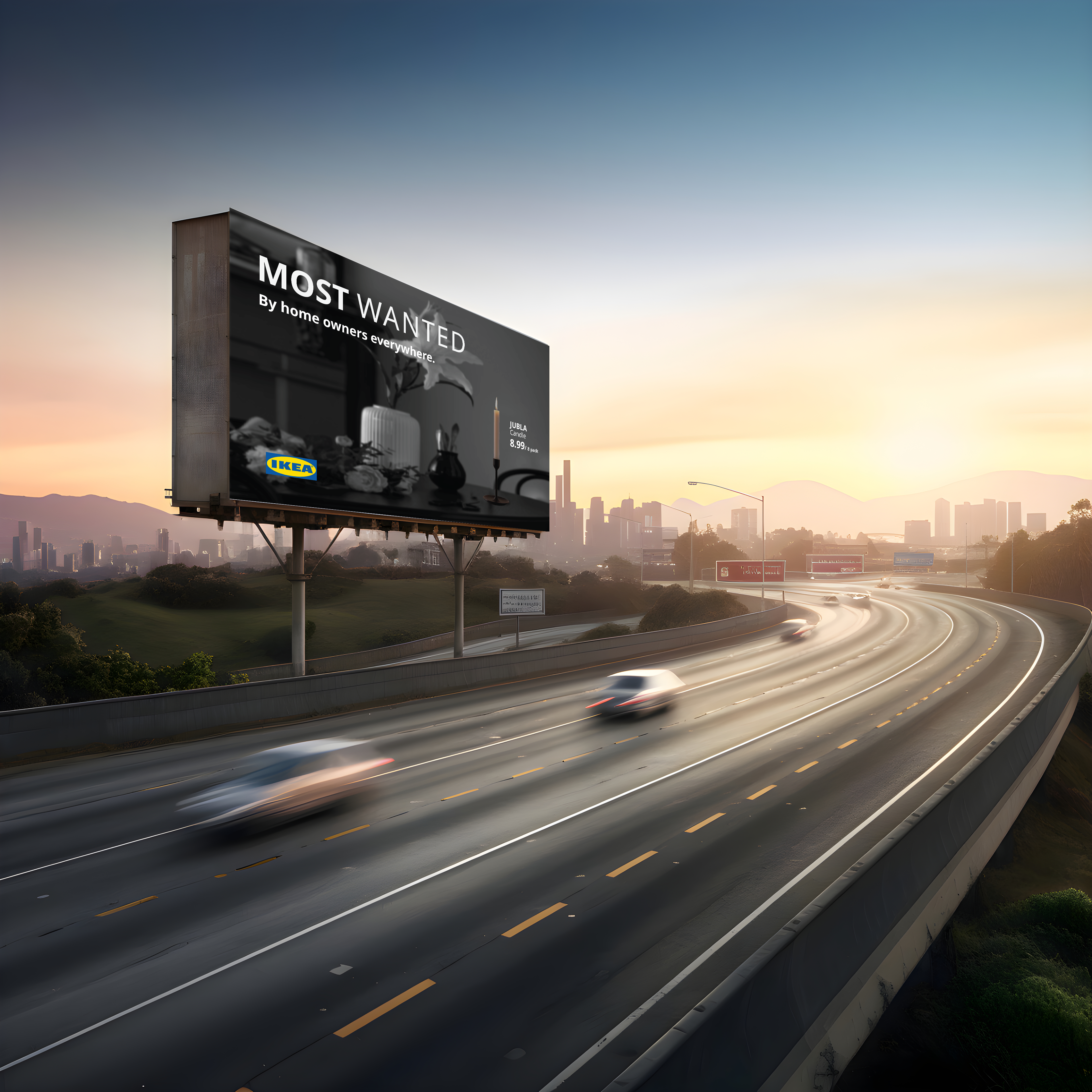
Highway Billboard (Day)
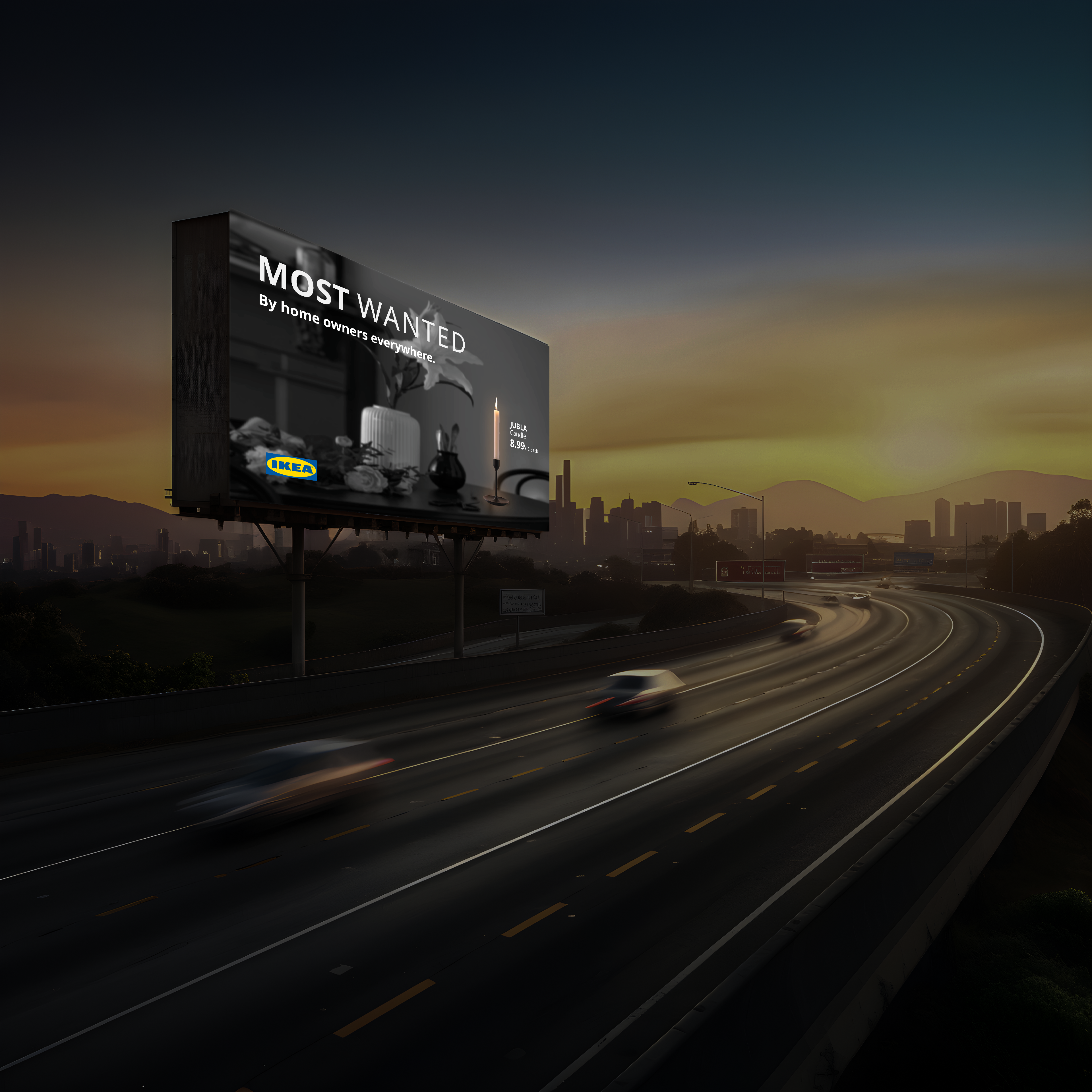
Highway Billboard (Night)
"INDIGENOUS HISTORIES" (Netflix)
BRIEF:
Create a campaign that allows a brand to find purpose within their brand and educate their audience
INSGHT:
Consumers are more likely to be informed and share their findings about indigenous culture if they are exposed to it
IDEA/CONCEPT:
With more people being aware of Indigenous histories, there is still a majority who aren't aware. With this campaign I wanted to bring awareness to the fact that we were (and are) always on Indigenous land. I chose to represent this using the well known Netflix screen by a play on words, as well as the corresponding visual elements shown in each one.
FINAL ADS
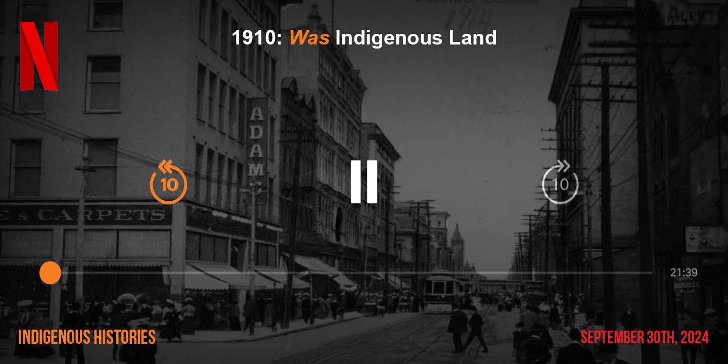
Poster 1
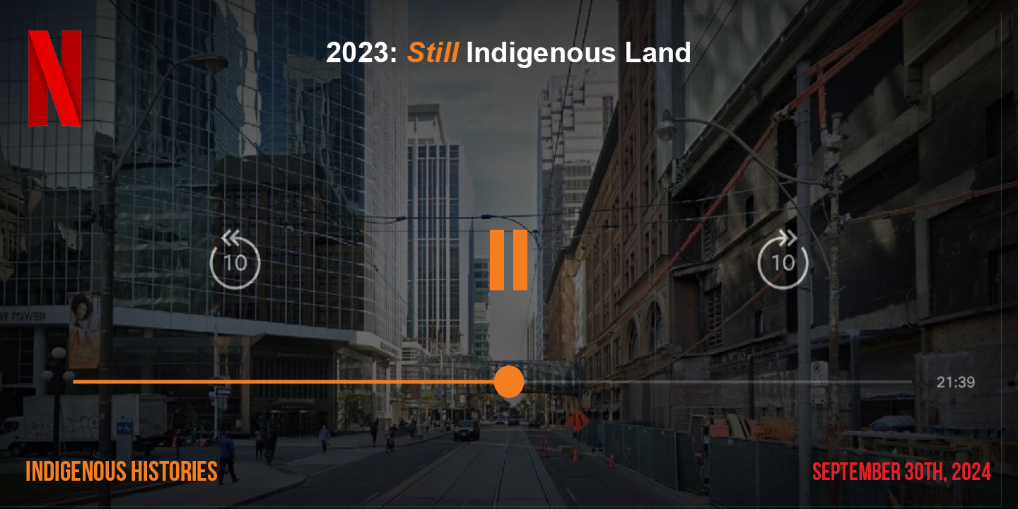
Poster 2
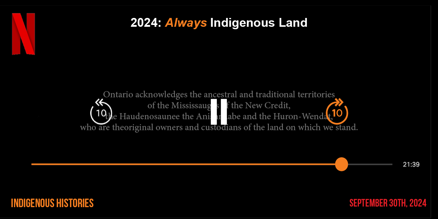
Poster 3
MOCKUPS
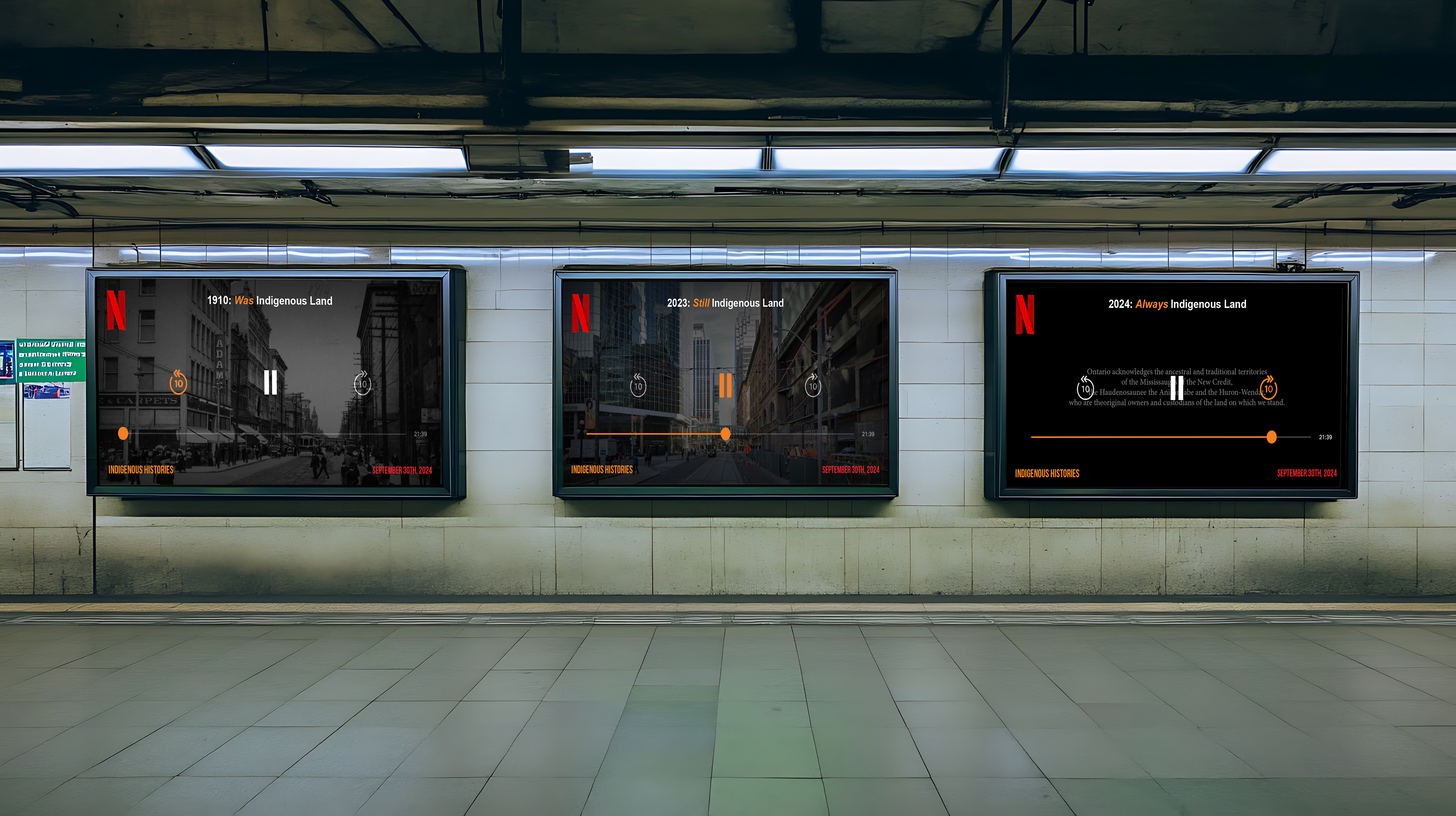
Subway Poster Mockup
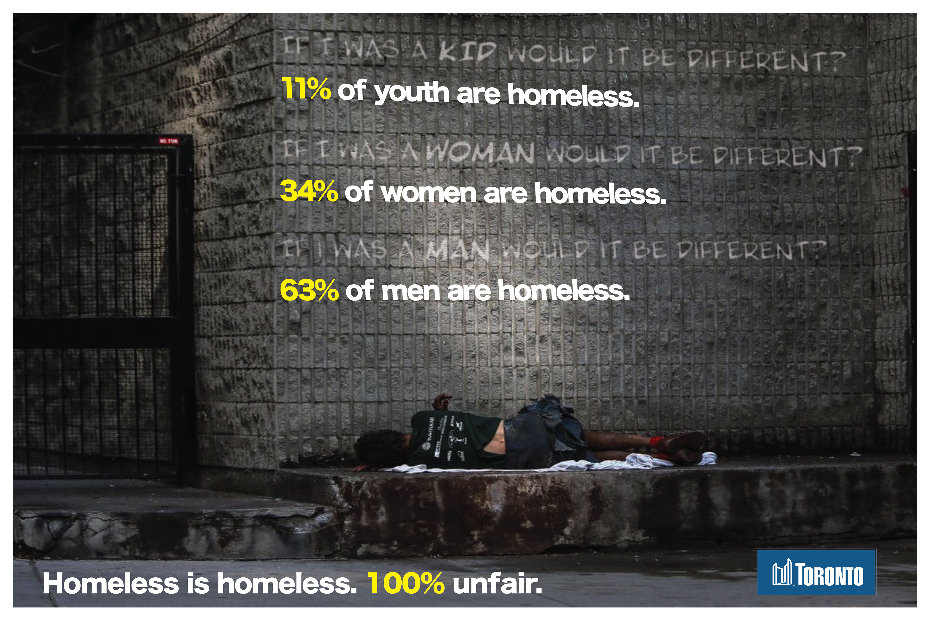
"HOMELESS IS HOMELESS" (City of Toronto)
BRIEF:
"Typographic Social Commentary"
Convey emotion through typographic design
IDEA/CONCEPT:
My rationale for this design was to effectively show the effects of homelessness apply to anyone. I used statistics as well as a diverse range of people who have to go through it. I wanted the text to look like it was written on the wall and integrated into the image itself.